Author: Tracy Sigler | Posted: June 19th, 2006 | | Tags: Handmade, mosaic | 11 Comments »

Larger, largest
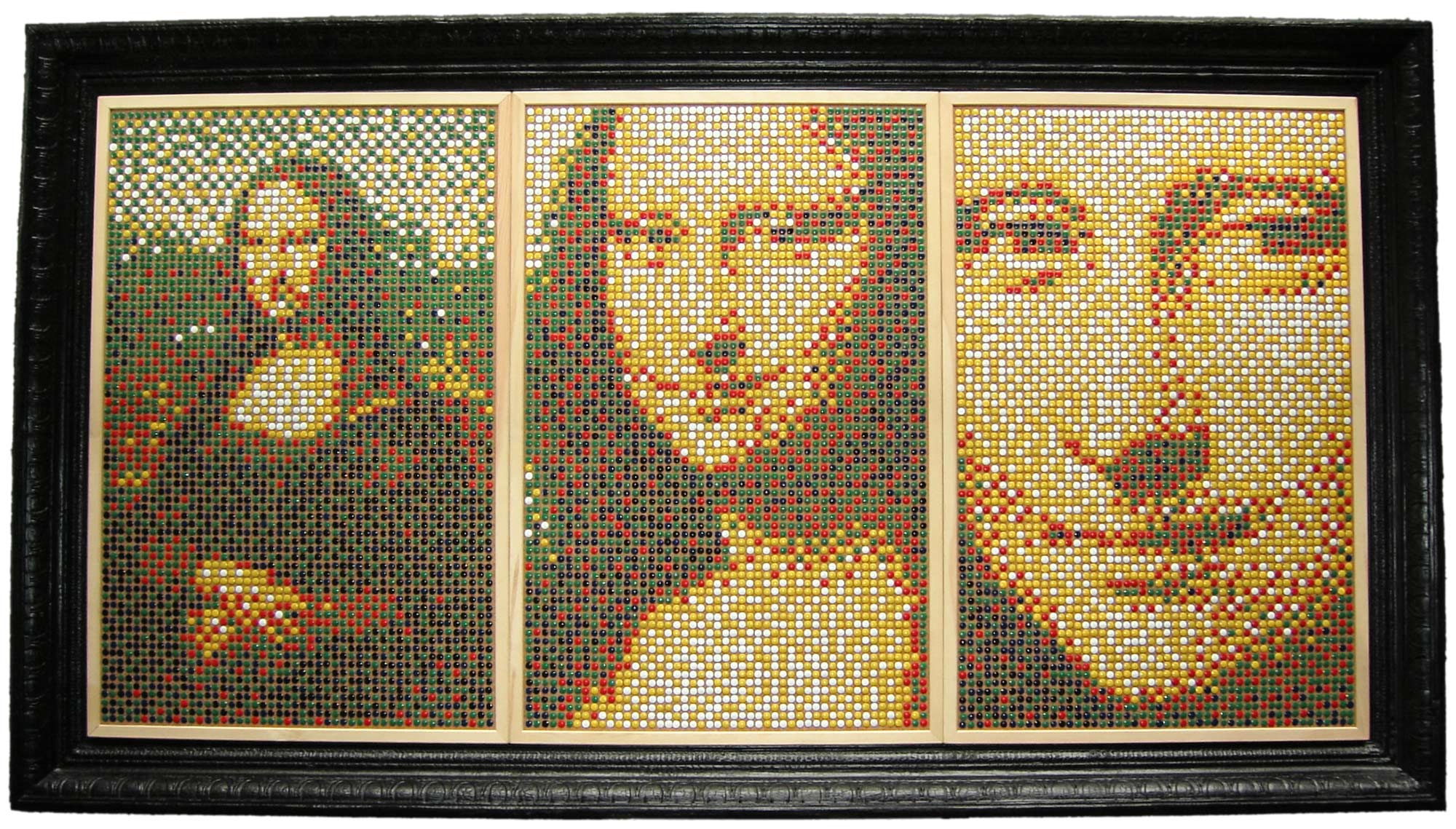
In this piece regular thumbtacks have been used in their usual, intended way, stuck into cork bulletin boards, but with unexpected results. The Mona Lisa was used as the basis for these mosaics because it is very recognizable, as art, to most people (with money) in the industrialized world. It appears the artist’s intent is to call attention the latent, or potential beauty of mundane objects.
Each piece of the triptych uses a different zoom level, 1x, 3x and 6x. All of the panels use the same number of tacks to communicate an image. It’s possible the artist is trying to say “Context is really important” or maybe “Resolution is a funny thing.” Even though the third panel provides more detail in the face, it’s less obvious this is the Mona Lisa. The first, and coarser image with background, or full context, is more easily recognized as Leonardo da Vinci’s masterpiece.
The highly ornate frame is an integral part of this piece. It has been severely burned, and then stabilized using space-age polymers. Statements the artist may be making with this frame:
- Beauty in the “every day” should be recognized, appreciated, even celebrated.
- Black is beautiful.
- Maarten Baas is brilliant.
- Smoke adds flavor.
- Nothing is too good to mess with.
Some details:
- Overall dimensions (including frame): 77.5″w x 43.5″h
- Resolution of each panel: 49×76
- Total number of thumbtacks: 11,172
- Approximate weight: Very heavy
Details: burnt frame, left eye of third panel

Triptych sans frame with guitar for scale reference.

Author: Tracy Sigler | Posted: April 10th, 2006 | | Tags: art, Handmade, mosaic | No Comments »

This is something I’ve wanted to try for a long time. The idea of using mundane objects to create something more interesting was calling me. I didn’t want to use “found” objects and put them into a new context, such as using a piece of machinery as a component in a piece of furniture. I’ve done that enough. This time, I wanted to use objects in their proper context, but in a way that was unexpected.
Below is a picture of my friends’ son Max. Step away from the monitor about ten feet to see the image really come together. Thumbtacks were used on a cork bulletin board, where they feel right at home, to create a low resolution portrait. This is the source image I used.
One way to do it:
- Open the source image in your favorite graphic editing software and reduce it to the needed resolution. For this example it was 35×49, pretty rough.
- Decide on color palette/Source the tacks. This was tough because most stores don’t have thousands of tacks just sitting in the aisles. I want to try push pins too, but thumbtacks just had a pleasing tactile quality (once they’re installed that is) so I had to do that. I was going to use the standard primary color, vinyl covered tacks. Then, Mary found these at the variety store down the street. I really liked the colors and I walked down there and bought every pack they had. Still wasn’t enough.
- Get the colors into the computer. I decided to scan them because photos can be a pain with highlights, shadows. Once I had the scan I picked the most representative color I could find from each tack.
- Create a custom palette using those colors. This may not be easy, depends on the software you’re using.
- Apply the palette and season to taste. In Photoshop you can manipulate the Diffusion, Pattern, and Noise options to get something that looks more interesting. For this pic of Max I wanted it diffused enough that when you are standing close by it’s a little hard to see.
- Layout the tacking pattern on the bulletin board. Most tacks, including push pins will do well spaced on 7/16 inch centers. I won’t recommend the way I did it. If you come up with something efficient please let me know by commenting here.
- Scale up the image, say 15X, and maybe overlay a grid to make it easier to follow. Print out the image if you won’t be working next to the screen.
That’s pretty much it. I’ll just say that it took a lot longer than it looks. I had it probably 75% done and had to start over because it looked blah. Lesson learned: crank up the contrast. I was also running out of tacks in a few colors. Adjusting the contrast helped but I still had to fake a lot of it at the end. And you know that gratifying sensation when you push a tack, the cork yields, and you feel it stick? Well, that goes away entirely after the first few hundred. This portrait has 1,715.
I’m going to do a small number more and then move on to something different. Grandmas unite! Put down your cross stitch, your needlepoint, and buy some tacks!
Detail of the eye area… looks like nothing, right?


